
What is data visualization?
I often go around with a sort of unspecified bad feeling towards decreasing daylight every winter. I know there are times when the sun sets and rises, I even have them listed in a spreadsheet, but this is not very helpful.
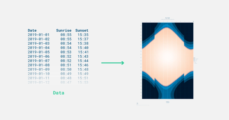
My colleague Anna Goffe and I decided to see if we could visualize this data. After trying several types of diagrams and ways to illustrate we settled for a line graph because it gave focus to the light. Meet: a data visualization! With this daylight visualization, I can see the speed of decreasing or increasing daylight each month. In the middle of Sweden we do have daylight for at least 6 hours in the winter, plus the twilight phases. After seeing this my vague feeling has shifted to more like getting a clear prognosis at the doctor’s
“You will be light deprived – exactly 17,5 hours on two days in December. Other than that, you will be fine!”
I get a new perspective on the raw data and more importantly on the phenomena itself. This is what data visualization does. You can have data in very many forms. It could be in a spreadsheet, in a database, in someone’s head, on paper.
Then you convert or encode it into something visual to give a new perspective or understanding of the data.
Sources and extras
We made a printed version of this visualization, The Day & Light Poster. It displays when the sun sets and rises throughout a year from a location of choice.
If you want an overview of different types of data visualization to get inspired, check out Data Viz Project
Written by Julia Johansson